Yes, this is the building being constructed at the moment... Brisbane Square. The idea is from the Federation Square design in Melbourne... except the design leaves food for thought. Whoever came up with the colours for this design should be shot immediately. For one, my architecture friends and i shiver everytime our bus passes this 'lankmark'. The colours are bright and vibrant... totally contrasting with the polluted river, stone treasury buildings (and others), and does not look in place. The second reason why I don't like this building is it shields the visibility of the Brisbane city hall from the river entrance. I didn't reaslise this until a few days ago. Was this planned? If it was, I'd like to see the reason why the council/developers would want to hide the 'heart' of Brisbane. I think above the first six levels, the design isn't too bad, but I won't comment too much on the first few levels...
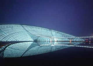
Contrast this to one of the beautiful buildings in Guang Zhou, China at the moment:
Guang Zhou Museum (The "Swan" by night)


No comments:
Post a Comment